Cut-off edges and dull colours: bleed, safe area and CMYK for AI images
Why AI images often print with words trimmed off and colours gone flat, and the three print settings that fix it before you pay for a print run.
· 6 min read
By the Blessed Pixels team
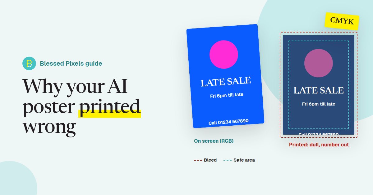
Two things go wrong when a business prints an AI image, and neither of them is blurriness. The phone number at the bottom gets sliced in half by the guillotine. And the electric blue that looked so good on your laptop comes back a sort of tired navy.
Both are predictable. Both come from the same root: an image made for a screen is being asked to behave like a sheet of paper. This guide covers the three print settings behind those problems (bleed, the safe area and CMYK colour) and what you can check yourself before you order 500 flyers.
If your worry is sharpness rather than edges and colour, we covered that separately in how big you can print an AI image.
Why printers ask for bleed, and why AI images don't have any
Printers don't print one flyer on one flyer-sized sheet. They print several on a big sheet and cut them out. The blade can't land on the exact same line every time, so if your background stops right at the edge, a slightly-off cut leaves a thin white sliver down one side.
Bleed is the fix. You extend the background a little past the finished edge, so whatever gets trimmed is just spare picture. Ask your printer how much they want: 3mm on each side is very common in the UK, and printers such as Solopress explain bleed in their support guides with diagrams of what gets cut. An A5 flyer with 3mm bleed is set up at 154 by 216mm instead of 148 by 210mm.
The awkward bit with AI images: there's nothing past the edge. ChatGPT, Midjourney and Canva give you a picture that ends exactly where it ends. To add bleed you either have to extend the picture outwards (more background, painted in convincingly) or shrink everything slightly so the bleed is plain colour. Stretching the whole image to fill the gap is the one to avoid, because it squashes faces and lettering.
Extending an image so the extra strip matches the rest is one of the jobs in our print-ready packages, along with the other set-up below.
The safe area: where your words should live
Bleed protects the background. The safe area protects everything that matters: your name, prices, the date of the event, a QR code, the phone number.
It's an invisible border inside the finished edge. Keep text and logos inside it and a wobbly cut can't touch them. Printers set their own measurement, and many show it as a dotted line on their templates. The instantprint guide to bleed shows the bleed, trim and safe lines on one picture, which is the quickest way to get it in your head.
AI tools have no idea any of this exists. They love putting the headline right up against the top edge and the small print hard against the bottom, because that looks dramatic on screen. Look at your image and ask a simple question: is anything you need to read within a finger's width of the edge? If yes, it needs moving in.
There's a related trap. AI images come in shapes like square or 2:3, and A sizes (A6 to A0) are a different, slightly longer shape. Squeeze a 2:3 image onto A4 and either the edges get cropped or there are empty bands. Cropping is usually fine for a background. It's a problem when the crop eats your text, which is why we list it among the things that usually go wrong with AI artwork.
Why colours print duller: RGB and CMYK
Your screen makes colour from light: red, green and blue (RGB). A printer makes colour from ink: cyan, magenta, yellow and black (CMYK). They overlap a lot, but not completely. Some screen colours have no ink match at all, and the brightest ones are the usual casualties: vivid blues, acid greens, neon pinks and oranges.
AI images are made for screens, so they're RGB. When the print company converts your file to ink, colours outside what ink can reach get pulled back to the nearest colour it can print. That's the "tired navy".
A few things worth knowing:
- Nobody can make a neon screen colour come out neon in standard four-colour ink. If that exact colour is your brand, ask your printer about special inks, or accept a slightly calmer version.
- Converting to CMYK yourself doesn't make colours brighter. It just shows you the truth earlier, which is the whole point. No surprise on delivery day.
- Some print-on-demand and online printers accept RGB files and convert for you. That's fine, but you still get the duller colours, you just see them later.
- Dark, rich blacks behave differently in ink too. Ask your printer whether they want a particular black for large dark areas.
Canva's help page on margins, bleed and crop marks covers the print download options there, if Canva is where you're finishing the design. If your printer asks for a CMYK PDF and you've no idea how to make one, that's a sensible point to let someone else set the file up.
A five-minute check before you order
You can do this with nothing more than the file and your printer's spec page.
- Find your printer's artwork guide and write down three numbers: finished size, bleed and safe area.
- Check the shape. Is your image the same proportions as the paper? If not, decide now what gets cropped.
- Look for anything readable near the edges. Phone numbers and web addresses are the usual victims.
- Check the text is real. AI tools still invent letters, so read every word slowly, out loud, especially prices and dates.
- Order a single proof copy if your printer offers one. It costs a little and it's the only way to see real ink on real paper.
If the check turns up problems you'd rather not fix yourself, our Fix and print package covers bleed, the safe area, print colours and replacing garbled text with real type. A person checks each file against your printer's spec. Our print artwork terms explain what happens if a printer still rejects the file.
Frequently asked questions
How much bleed should I add?
Whatever your printer asks for, so check their artwork guide first. 3mm on each edge is very common in the UK, but large-format printing such as banners often needs more.
Can I print an RGB image without converting it?
Often, yes. Many printers convert it for you. The colours still shift to what ink can print, so expect bright colours to come out a little calmer either way.
Why did my printer say there's no bleed when my image fills the page?
Because the background stops exactly at the finished edge. Bleed has to go beyond the edge, so the file needs to be slightly bigger than the paper size.
Is the safe area the same as a margin?
Close enough. It's the border inside the trim line where text and logos are safe from the cut. Printers usually mark it on their templates.
Does adding bleed change my design?
A little. The extra strip is trimmed off, so nothing important can sit in it. If the image has to be extended to create bleed, the new strip should match the rest closely enough that nobody notices.